


Tips and Best Practices
Picture this: You’ve got 15 seconds. That’s how long the average visitor gives your website before deciding whether to stay or bounce. And guess what’s making that split-second decision? Your good website layout.
I’ve been in the trenches of web design for years, and I can tell you this, a layout isn’t just about looking pretty. It’s about creating an experience that feels so natural, your users don’t even think about it. They just flow through your site like water finding its way downhill.
Today, we’re diving deep into the art and science of website layout design. Whether you’re a startup founder bootstrapping your first site or a freelancer looking to level up your client work, this guide will transform how you think about digital real estate.
What Makes a Website Layout Actually Good?
Let’s cut through the fluff. A good website layout isn’t about following the latest Instagram trend or copying what everyone else is doing. It’s about understanding your users’ mental model and meeting them exactly where they are.
The Essential Elements Every Layout Needs
When I audit websites, I look for these non-negotiables:
Clear Visual Hierarchy: Your most important elements should scream for attention (politely, of course). Think of it like a newspaper, the headlines grab you first, then subheadings guides you deeper.
Intuitive Navigation: If users need a treasure map to find your contact page, you’ve already lost. Your navigation should be like a good friend who’s always there when you need them, never overwhelming.
Strategic Whitespace: Here’s something that’ll blow your mind. Whitespace isn’t empty space. It’s breathing room for your content. I call it the “pause between musical notes” that makes the melody beautiful.
Consistent Branding: Your website should feel like one cohesive experience, not a patchwork quilt of random design decisions.
Fast Loading Elements: A beautiful layout that takes forever to load is like a sports car stuck in traffic, all potential, no performance.
How Website Layout Impacts User Experience (And Your Bottom Line)
I once worked with a client whose bounce rate dropped from 78% to 34% with just layout changes. No new content, no fancy features, just better website structure.
Here’s the psychology behind it: When users land on your site, their brains are doing rapid-fire pattern recognition. They’re asking:
- Where am I?
- What can I do here?
- How do I get what I want?
A user-friendly website layout answers these questions before users even consciously ask them.

The Cognitive Load Connection
Every design choice either reduces or increases cognitive load. That cluttered sidebar? Mental tax. That confusing navigation? Another tax. Before you know it, your users are mentally exhausted and heading for the exit.
The best responsive website layout designs feel effortless because they’ve eliminated decision fatigue at every turn.
Common Layout Mistakes That Kill Conversions
I’ve seen these layout sins more times than I can count:
The Everything-Above-The-Fold Trap: Cramming your entire value proposition into that first screen creates visual chaos. It’s like trying to have five conversations at once.
Mobile Afterthought Syndrome: Designing for desktop first, then squishing everything down for mobile. In 2025, that’s like building a car and hoping it’ll work as a boat.
The Invisible CTA Disease: Your call-to-action button should be impossible to miss. If it’s playing hide-and-seek with your users, you’re leaving money on the table.
Feature Overload: Just because you can add something doesn’t mean you should. Every element needs to earn its place on the page.
Choosing the Perfect Layout for Your Website
Here’s my framework for how to design a good website layout:
Start with Purpose
Before you touch a single pixel, ask yourself: What’s the one thing you want users to do on this page? Everything else should support that goal.
Match Layout to Industry
E-commerce sites need product showcases and clear purchase paths. Portfolio websites should let the work speak for itself. Blog layouts prioritize readability and content discovery.
I’ve noticed that e-commerce website layout ideas that work best follow the “golden triangle” principle. Logo top left, navigation across the top, search prominent, and products in a scannable grid.
For small business website layouts, simplicity wins every time. You’re not Amazon, you don’t need their complexity.
Mobile-First Layout Design: It’s Not Optional Anymore
Here’s a stat that’ll wake you up: Over 60% of web traffic comes from mobile devices. Yet I still see websites that treat mobile like an afterthought.
The Mobile-First Mindset
When you design mobile-friendly website layouts first, you’re forced to prioritize. You can’t fit everything, so you keep only what matters most. Then, when you expand to desktop, you’re adding enhancements, not cramming things in.
Key mobile layout principles:
- Thumb-friendly tap targets (44px minimum)
- Single-column content flow
- Prominent search functionality
- Simplified navigation (hamburger menus done right)
Latest Website Layout Trends That Actually Matter
Trends come and go, but these modern website layout approaches have staying power:
Asymmetrical Layouts
Breaking the grid creates visual interest and guides attention in unexpected ways. But use this power wisely. Asymmetry should feel intentional, not accidental.
Dark Mode Considerations
It’s not just about looking cool. Dark layouts can reduce eye strain and make colors pop. Just ensure your contrast ratios still meet accessibility standards.
Micro-Interactions
Small animations that provide feedback make interfaces feel alive. Think of the subtle hover effects or the satisfying “whoosh” of a completed form submission.
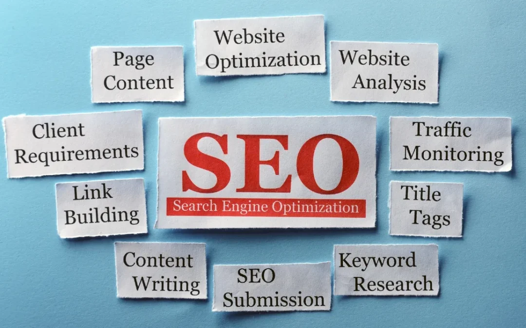
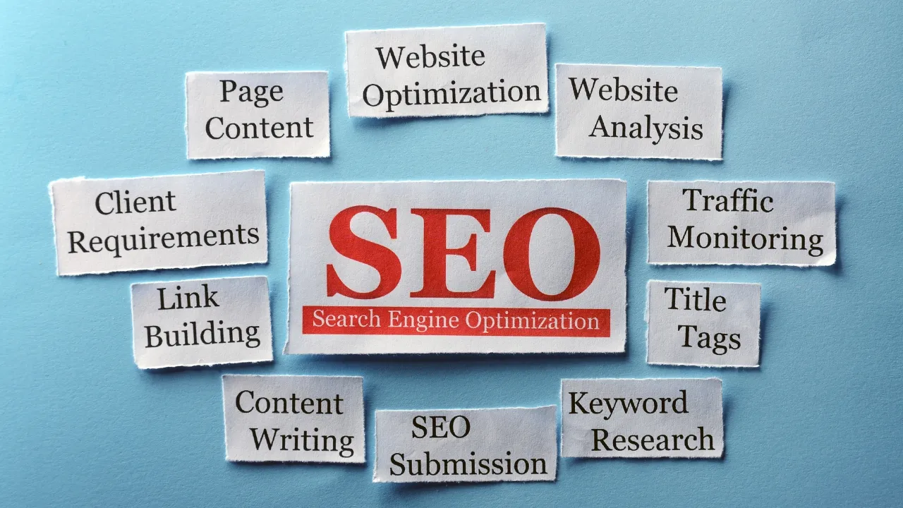
SEO-Friendly Layout Optimization
Your SEO-friendly website layout should make both users and search engines happy. Here’s how they intersect:
Page Speed Impact: Clean, efficient layouts load faster. Google notices.
Mobile Responsiveness: Not just a ranking factor, it’s table stakes in 2025.
Structured Content: Use proper heading hierarchy (H1, H2, H3) to help search engines understand your content structure.
Internal Linking Flow: Your layout should encourage natural link discovery, keeping users (and crawlers) engaged longer.
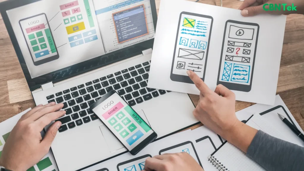
Essential Tools for Creating Effective Layouts
Let me break down the tool landscape based on your needs:
| Tool Type | Best For | Top Recommendations |
|---|---|---|
| No-Code Builders | Quick launches, non-technical users | Wix, Webflow, WordPress |
| Design Tools | Professional prototyping | Figma, Adobe XD, Sketch |
| E-commerce Platforms | Online stores | Shopify, WooCommerce |
| Wireframing | Planning and iteration | Balsamiq, Marvel |
Pro tip: Start with wireframes, move to high-fidelity designs, then build. Skipping straight to building is like constructing a house without blueprints.
The Art of Whitespace in Website Design
Whitespace or as I prefer to call it, “breathing space” is your secret weapon for creating minimalist website layouts that convert.
Think about Apple’s website. What strikes you first? It’s not what’s there, it’s what’s not there. Every element has room to breathe, making the important stuff impossible to ignore.
Strategic Whitespace Rules:
- Use it to group related elements
- Create separation between sections
- Give your CTAs breathing room
- Don’t fear empty space, embrace it
Making Your Layout Accessible to Everyone
Website layout accessibility isn’t just nice to have. it’s essential. Plus, accessible design often improves usability for everyone.
Color and Contrast: Ensure sufficient contrast ratios (4.5:1 for normal text, 3:1 for large text).
Keyboard Navigation: Every interactive element should be reachable via keyboard.
Screen Reader Friendly: Use semantic HTML and proper ARIA labels.
Text Scalability: Your layout should work when users zoom to 200%.
Testing and Improving Your Layout Performance
Here’s my testing framework for effective website layout strategies:
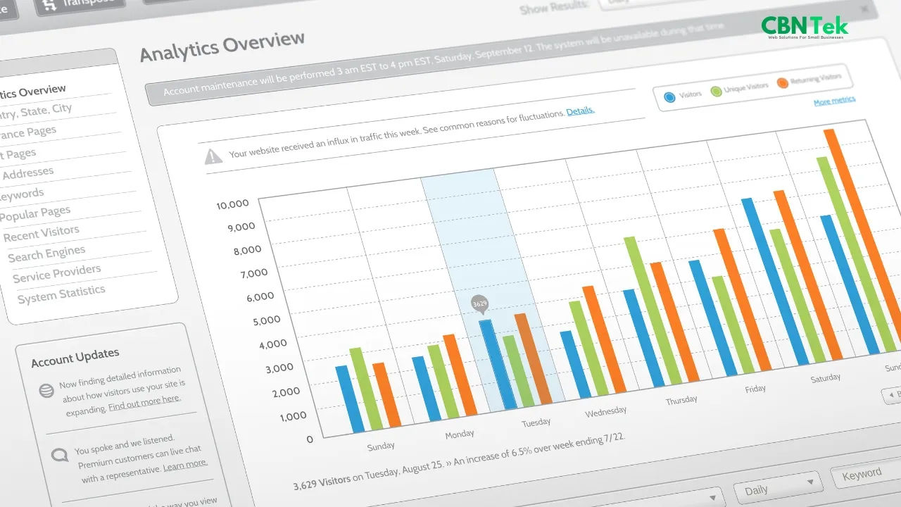
Heat Map Analysis
Tools like Hotjar show exactly where users click, scroll, and get stuck. I’ve discovered navigation issues this way that traditional analytics missed.
A/B Testing Key Elements
Test your CTAs, navigation placement, and content hierarchy. Small changes can yield massive improvements.
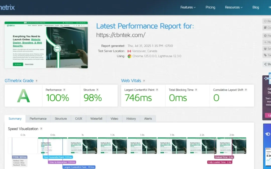
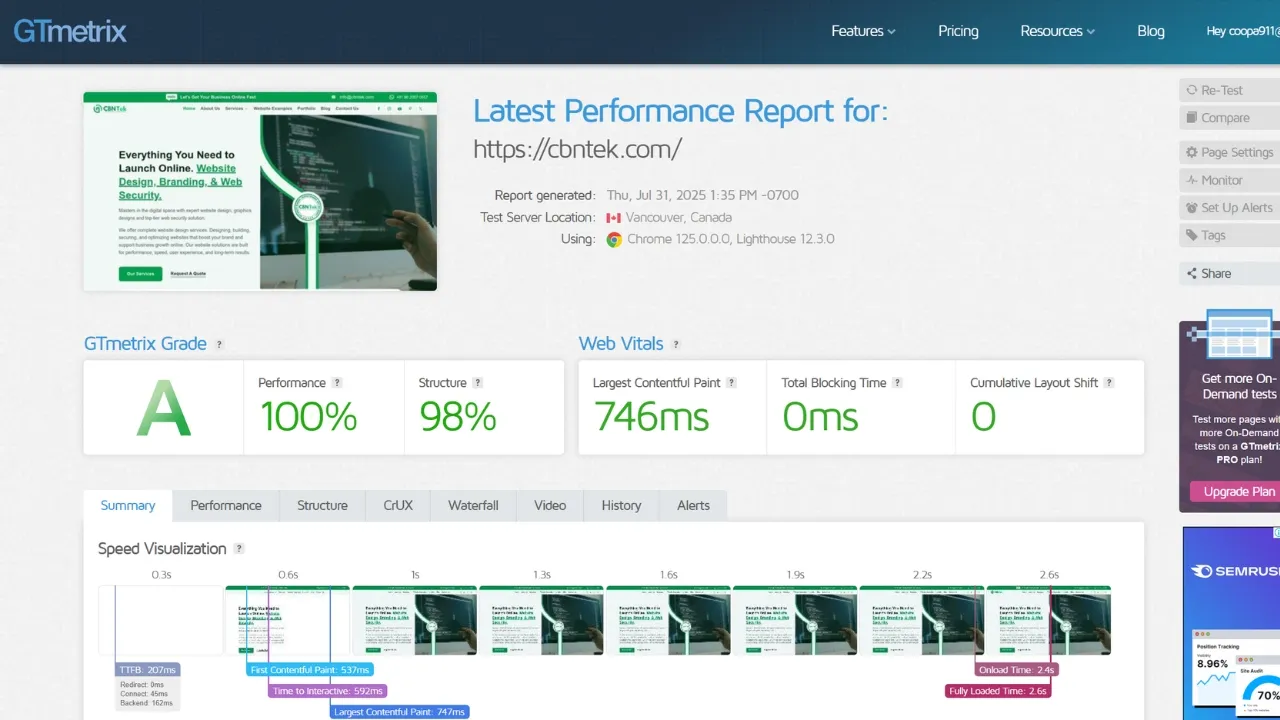
Performance Monitoring
A beautiful layout that loads slowly is a beautiful failure. Monitor Core Web Vitals religiously.
User Feedback Sessions
Nothing beats watching real users interact with your layout. Their confusion points are your improvement opportunities.
Templates vs. Custom: The Eternal Debate
Should you use simple website layout templates or go custom? Here’s my honest take:
Templates work when:
- You’re budget-conscious
- You need to launch quickly
- Your industry has established patterns
- You’re testing a concept
Custom layouts win when:
- You need unique functionality
- Brand differentiation is crucial
- You have complex requirements
- Budget allows for the investment
Color Schemes and Typography That Support Great Layouts
Your layout is the stage, but color schemes and fonts are your performers.
Color Psychology in Layout
- Blue: Trust and professionalism (finance, healthcare)
- Green: Growth and harmony (environment, wellness)
- Orange: Energy and enthusiasm (sports, entertainment)
- Black/White: Sophistication and clarity (luxury, tech)
Typography Hierarchy
Your font choices should create natural reading flow:
- Headlines grab attention
- Subheadings guide the journey
- Body text delivers the message
- Captions provide context
When to Redesign Your Website Layout
I get this question constantly: “How often should I update my layout?”
Red flags that signal it’s time for a refresh:
- Bounce rates consistently above 70%
- Mobile traffic performing poorly
- Conversion rates plateauing
- Technology becoming outdated
- Brand evolution outgrowing current design
But here’s the thing: Don’t redesign for the sake of redesigning. Data should drive the decision, not boredom with your current look.
Industry-Specific Layout Strategies
Different industries have different best website layout needs:
SaaS and Tech Companies
Focus on clear value propositions, feature demonstrations, and trust signals. Landing page website layouts should guide users from problem awareness to solution trial.
Creative Portfolios
Let the work shine. Portfolio website layouts should be galleries, not distractions. Think museum walls, not busy marketplaces.
Professional Services
Emphasize credibility, case studies, and clear contact paths. Users need to understand your expertise quickly.
E-commerce
Product discovery, filtering, and checkout flow optimization are paramount. Every layout decision should reduce friction in the buying journey.
Future-Proofing Your Website Layout
The digital landscape evolves fast, but some principles remain constant:
Progressive Enhancement: Build a solid foundation, then add fancy features that degrade gracefully.
Flexible Grid Systems: Use CSS Grid and Flexbox for layouts that adapt to any screen size.
Component-Based Thinking: Design modular elements that can be rearranged and reused.
Performance First: Fast beats beautiful every time in user experience.
Wrapping Up: Your Layout Success Blueprint
Creating a good website layout isn’t about following every trend or using every tool. It’s about understanding your users, serving your business goals, and executing with intention.
Remember: Your layout is a conversation with your visitors. Every element should either move that conversation forward or get out of the way.
Start with your users’ needs, prioritize ruthlessly, test constantly, and iterate based on real data. The best layouts feel invisible because they just work.
Your next steps:
- Audit your current layout against the principles we’ve covered
- Identify your biggest pain points (traffic, conversions, mobile performance)
- Pick one area to improve and test the results
- Scale what works, abandon what doesn’t
The perfect layout doesn’t exist, but the right layout for your users and goals absolutely does. Now go build something that makes their experience effortless and your business successful.
Ready to transform your website layout? Start with a simple audit of your current design using the checklist above. Small improvements compound into big results and your users (and conversion rates) will thank you for it.
What’s the biggest layout challenge you’re facing right now? I’d love to hear about your experience in the comments below. If you need help with designing a website for your business, do not hesitate to reach out to us.


0 Comments